
I designed a scalable, multi-brand design system for Shipeezi from the ground up, replacing a fragmented UI built on outdated frameworks like Bootstrap and MUI. Using atomic design principles, Tailwind CSS tokens, and ShadCN UI, I created over 200 Figma components with full support for light mode and future-ready dark mode.
The system brought visual consistency, reduced design-developer friction, and improved frontend delivery speed by ~40%. I also introduced clean interaction patterns, a new table filtering system, and a modular Kanban view to support workflow-heavy use cases, empowering teams to build faster, with clarity and confidence.
Client
Shipeezi
Industry
Logistics / SaaS
Duration
12 months
Role
Sr. Product Designer
Team Size
1
🧩 Problem Statement
Shipeezi’s frontend had grown messy over time. Multiple CSS frameworks including an outdated version of MUI and Bootstrap, were mixed together, resulting in bloated code and clashing styles.
There was an old “design system,” but it had:
- No consistent rules or methodology
- Several versions of the same component (e.g. 5 different buttons)
- No theme support (no dark mode or token structure)
- Designs that were not aligned with what was shipped in code
Old UI
Frontend teams struggled to maintain or scale the UI, and designers had no clear structure to work with. Every new screen required starting from scratch.
I rebuilt the design system from the ground up:
- Create a unified and scalable component library
- Tailwind CSS and ShadcnUI as base for easy developer handoff
- Introduce a token-based theming system (including dark mode)
- Gradually remove legacy bloat and bring consistency across
New UI
🔍 Research & Audit
I started by doing a complete UI audit:
- Catalogued duplicate and outdated components
- Compared design files vs live UI to spot mismatches
- Interviewed developers to understand pain points in the current system
- Reviewed usage of old libraries like Bootstrap, MUI, and legacy utilities
Key issues discovered:
- Design components didn’t match code behavior or styles
- Developers were rewriting the same components again and again
- No system for colors, spacing, or typography—everything was hard-coded
- Previous designers had not followed any reusable or scalable methodology
🧠 Strategy & Ideation
With a clean slate, I established a new foundation based on:
- Atomic Design to organize UI from smallest to most complex elements
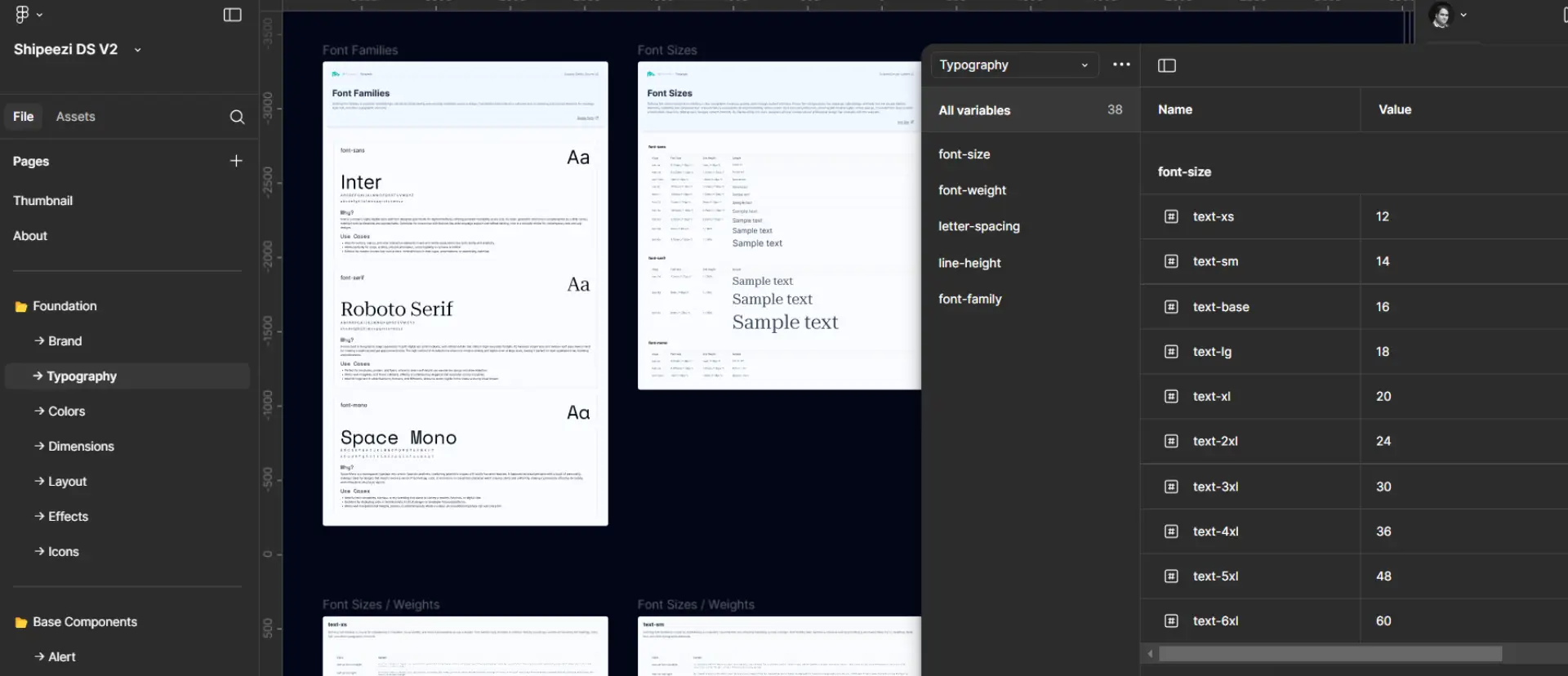
- Design Tokens for color, spacing, typography, radius, and shadows
- Tailwind utility classes to tightly align Figma designs with the real codebase
- ShadCN UI components as the base React layer to speed up development
- Light mode first, with all tokens built to support dark mode aswell
I also made sure the system could support multiple brands with subtle style variations using token overrides.
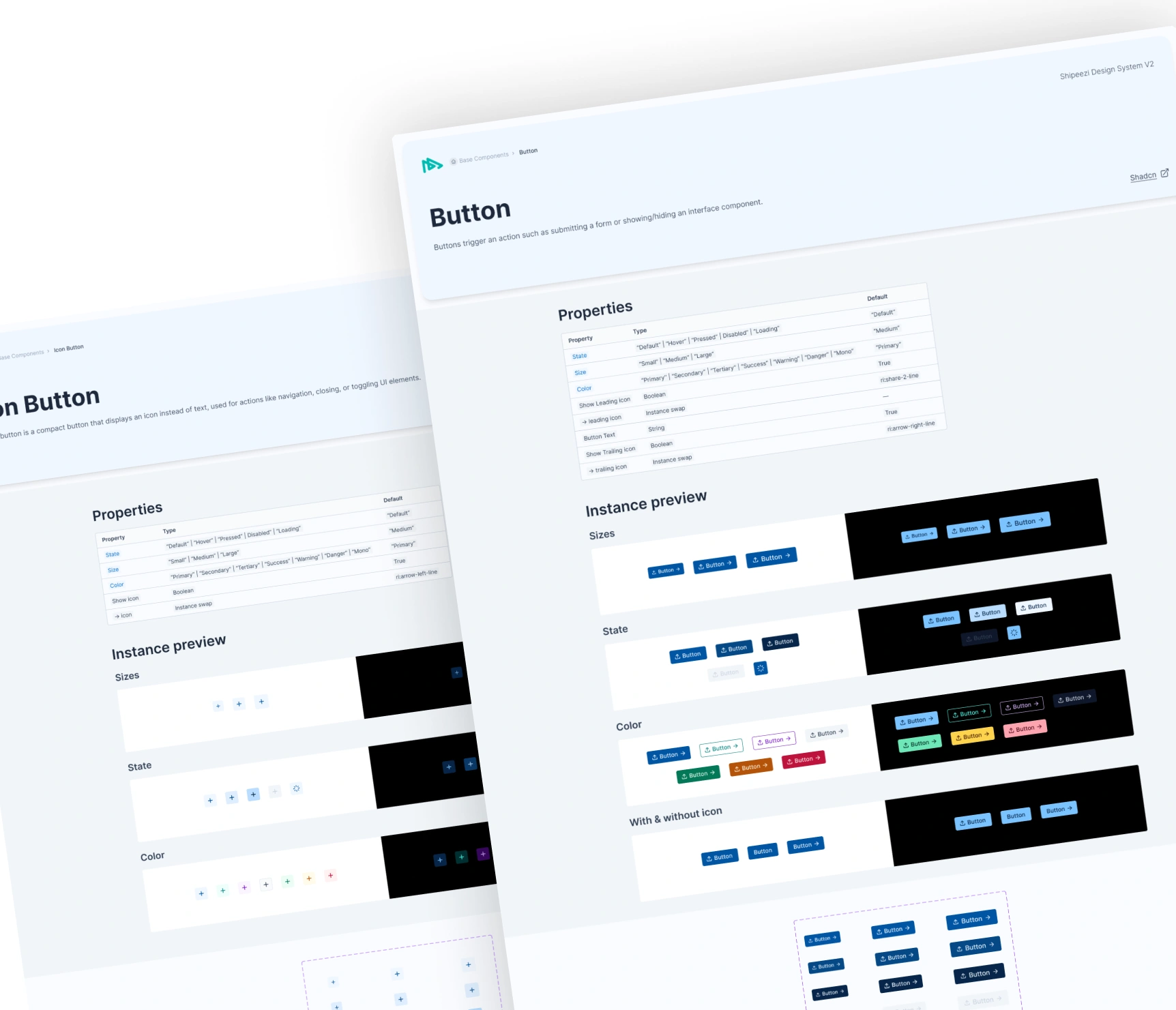
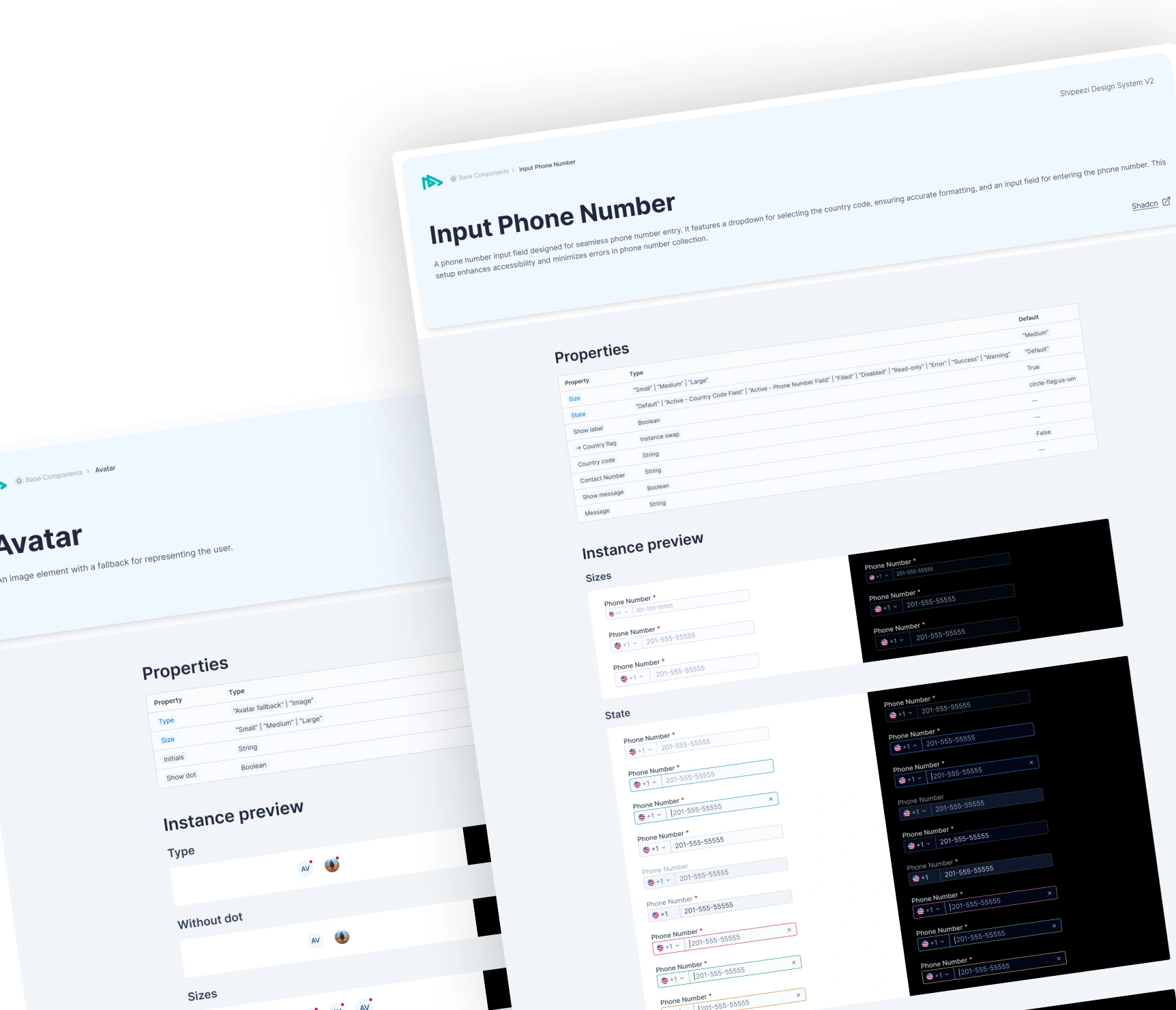
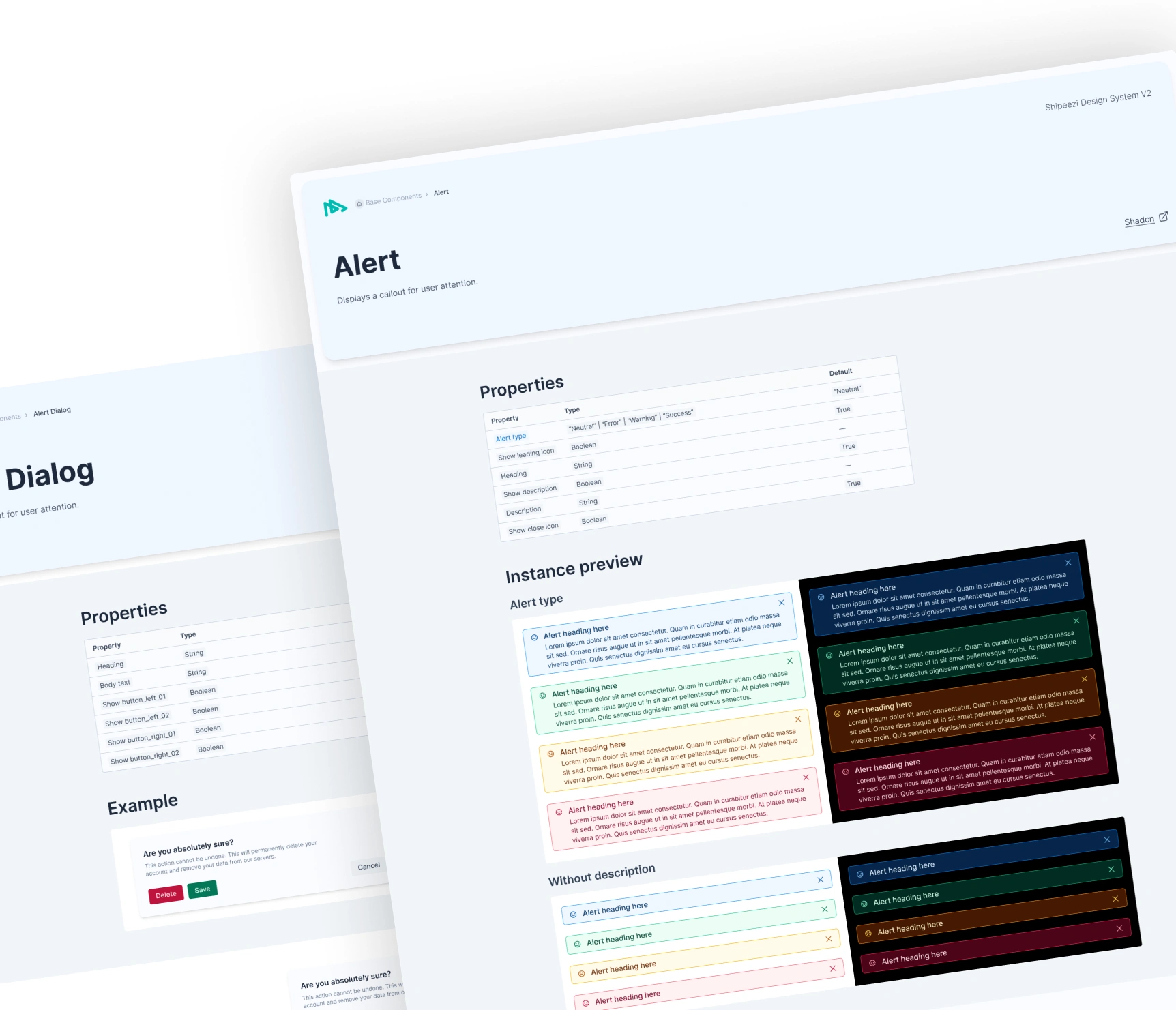
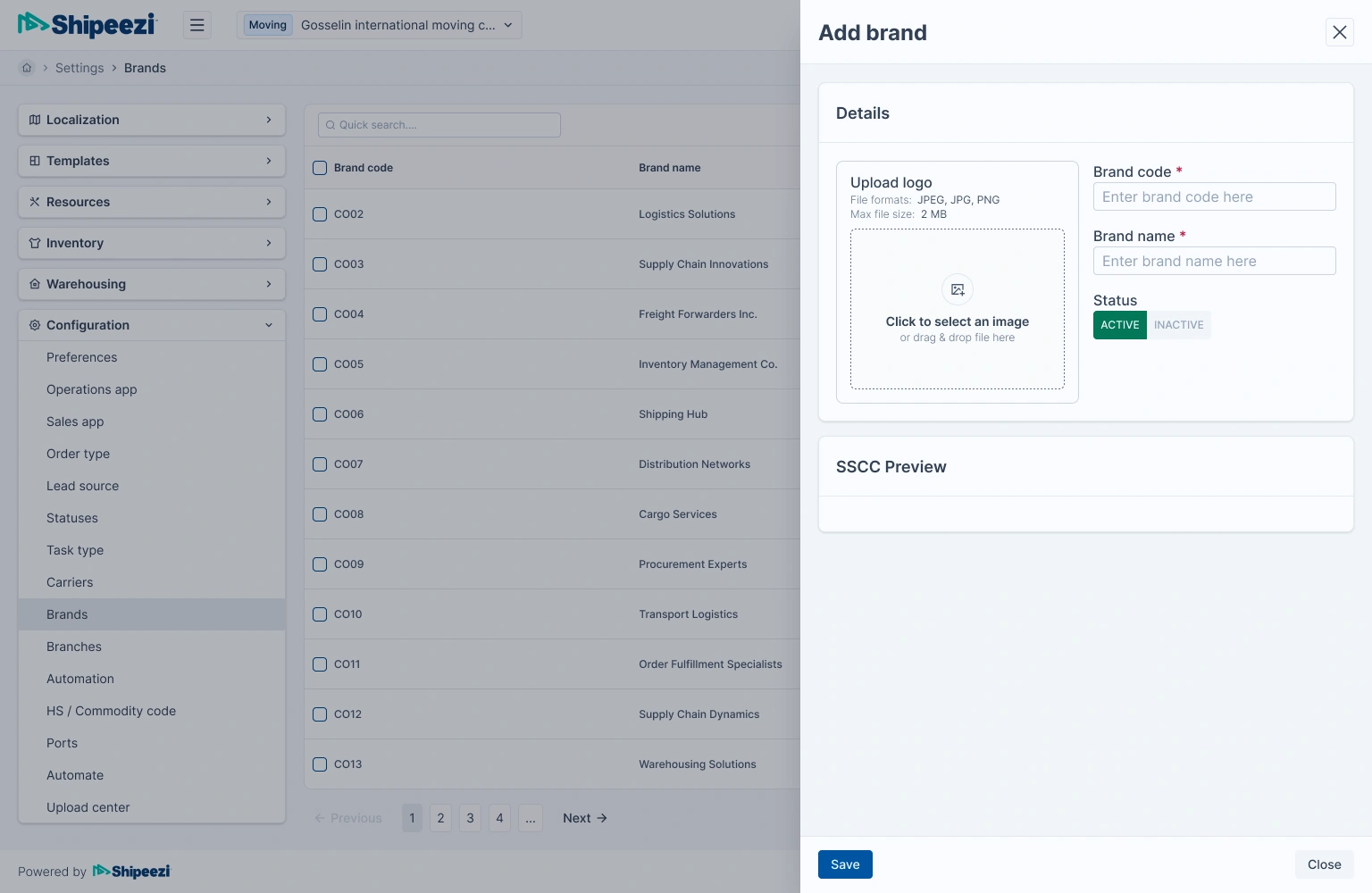
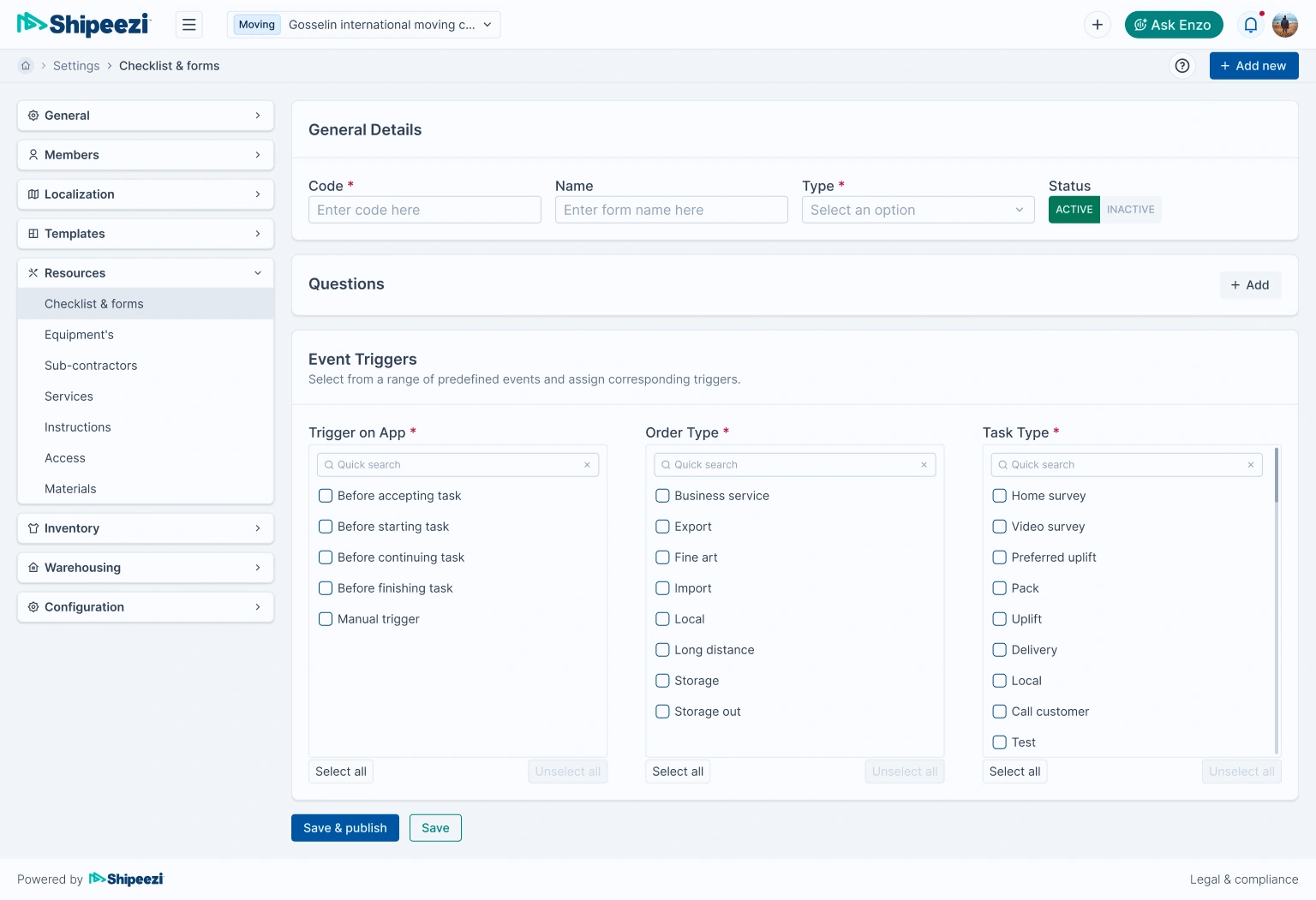
✍️ Design Execution
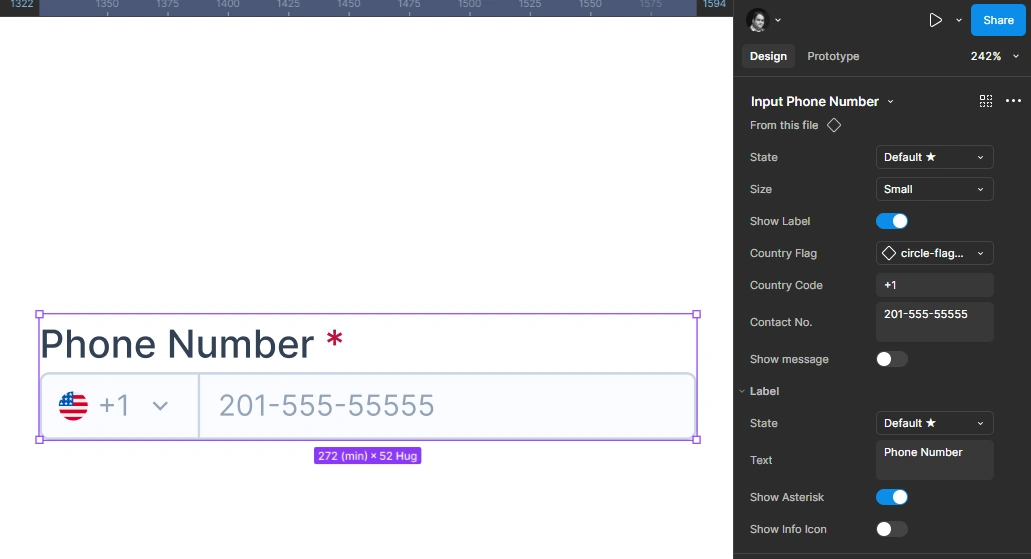
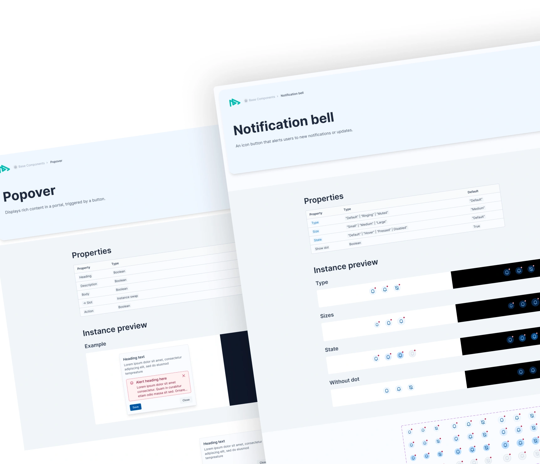
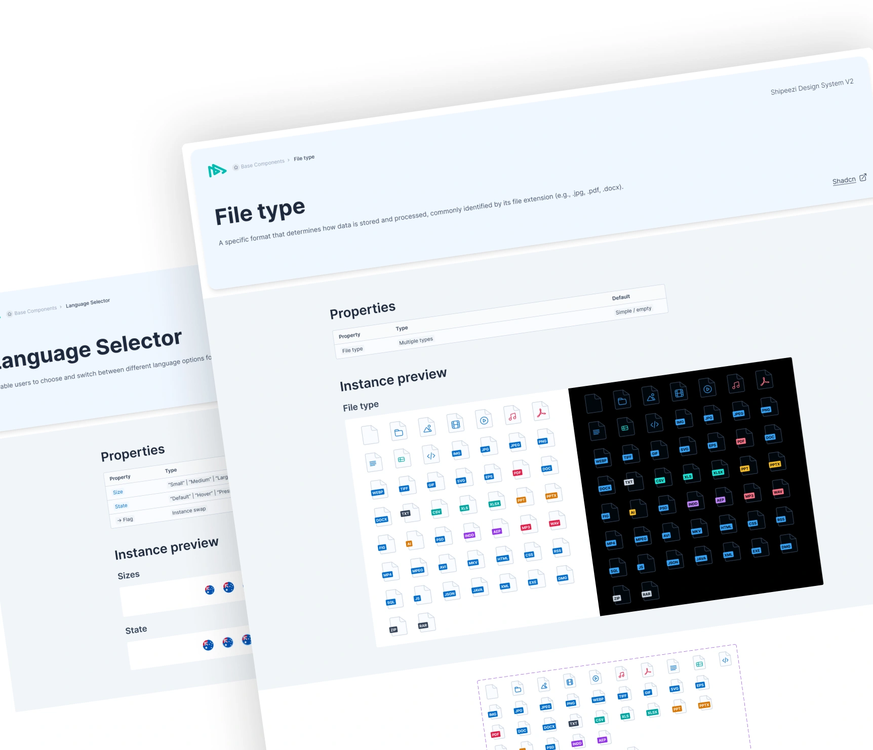
- 200+ Figma components and variants, organized by atomic structure
- Shared tokens for color, spacing, radius, and typography
- Layout templates that matched Tailwind’s spacing scale
- States for interaction (hover, focus, disabled, error) across all components
- Custom documentation inside Figma for developers and designers
Naming conventions, properties, and layer structures were all optimized for developer handoff.
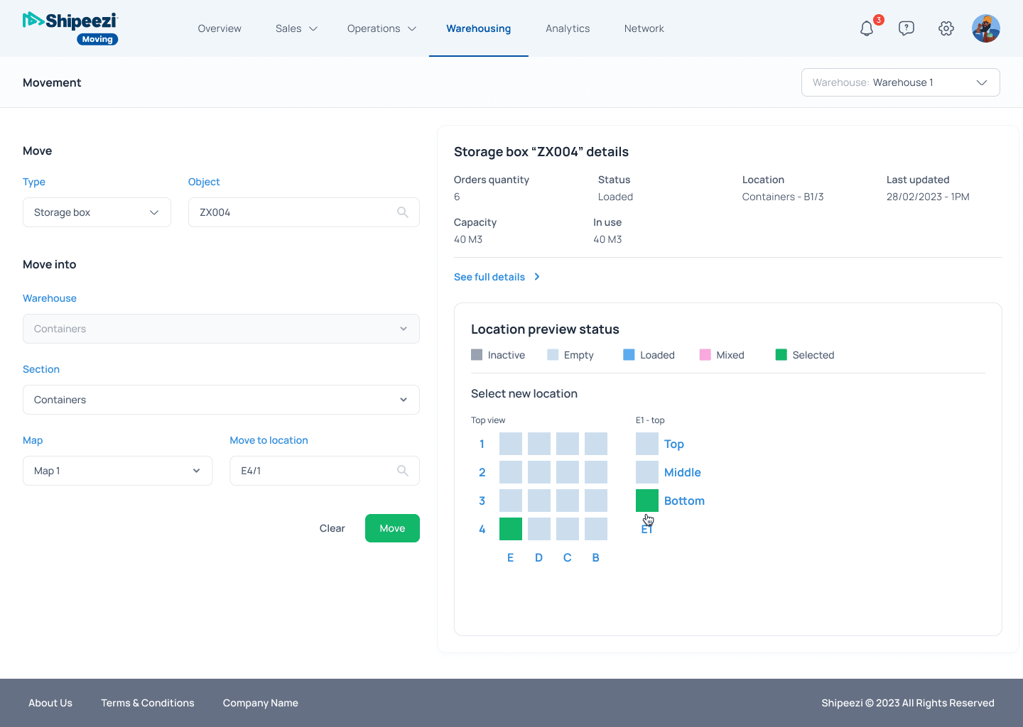
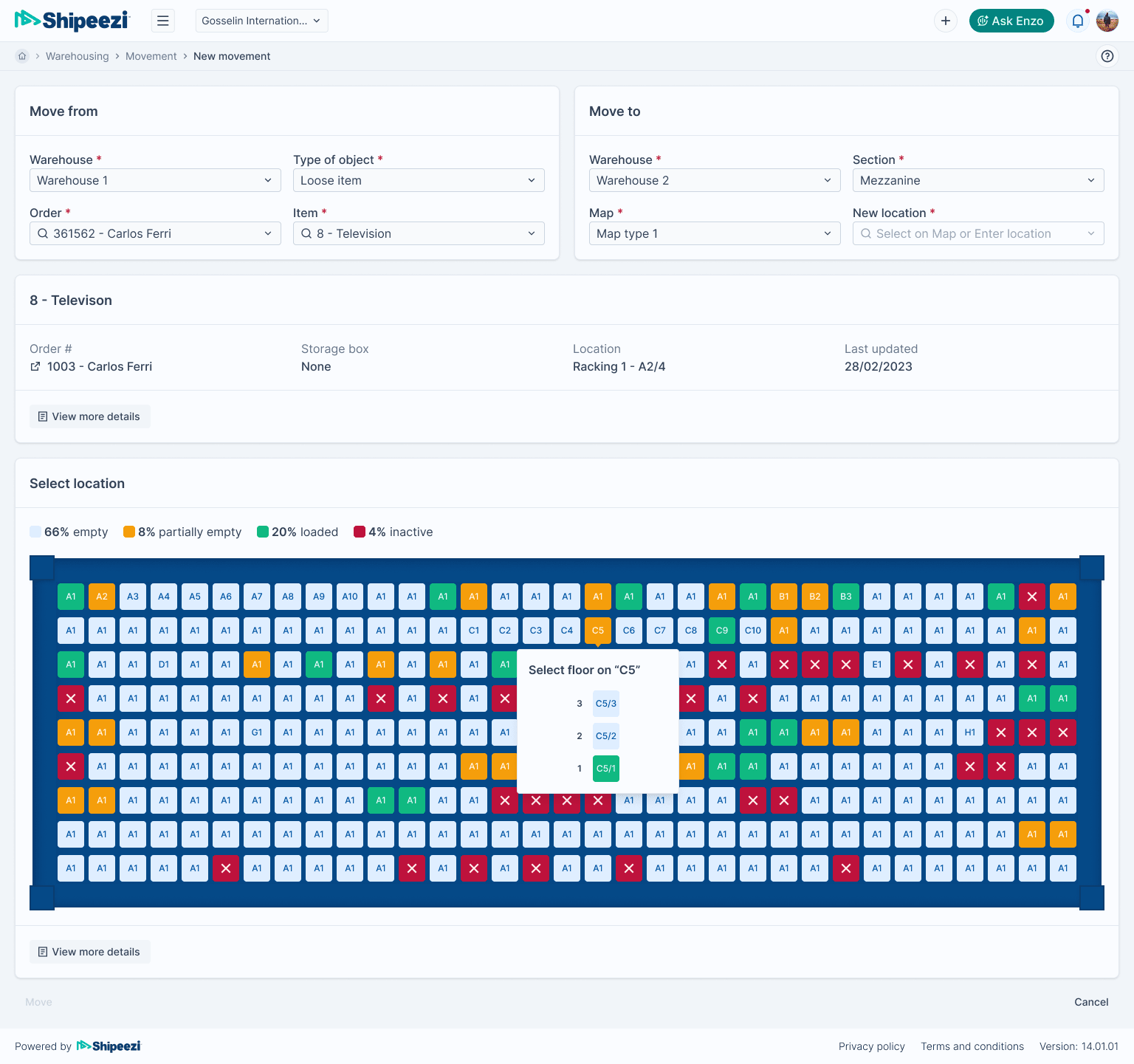
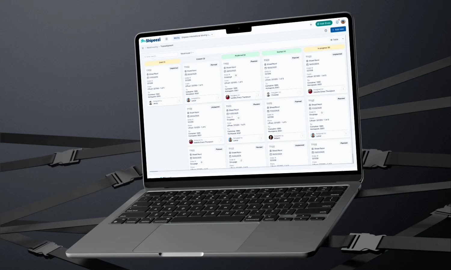
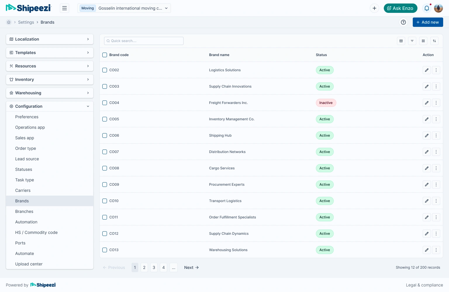
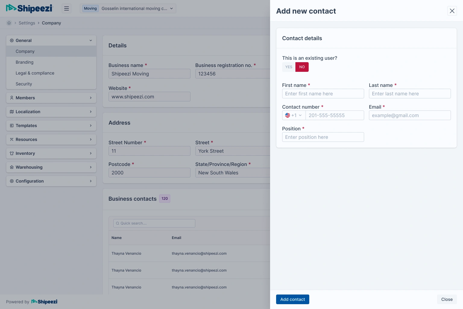
🗂️ Table Filters & New Kanban View
To address UX gaps in content-heavy interfaces like order management and project workflows, I introduced two major UI upgrades:
Smart Filtering System for Tables
Most tables in the legacy product were overwhelming—with no filtering or search options, leading to user frustration.
I redesigned the filtering experience from scratch, focusing on flexibility, clarity, and ease of use:
- Sticky filter bar with multi-select dropdowns, date range pickers, and keyword search
- Saved filters with custom names and one-click recall
- Clear filters action with visual tags showing active filters
- Designed to be fully responsive and tokenized for light and dark themes
This upgrade made it dramatically easier for users to slice through large datasets—particularly valuable for logistics managers tracking shipments and exceptions.
Modular Kanban View
To support project workflows and drag-and-drop task management, I introduced a new Kanban board layout.
Highlights:
- Columns based on custom statuses (configurable by admin users)
- Drag-and-drop cards with real-time visual feedback
- Card previews included badges, assignee avatars, priority, and status indicators
- Right-click context menus for card actions
- Keyboard accessibility and focus ring support for power users
The Kanban board allowed Shipeezi to extend the design system into more workflow-focused use cases, giving users a visual way to organize tasks, shipments, or inventory across pipelines.
🎯 Interaction Design
As part of the design system overhaul, I focused on refining the most common user interactions across Shipeezi’s platforms. The goal was to reduce cognitive load and ensure consistent behavior across different modules and teams.
Key interaction improvements included:
- Button States: Unified hover, focus, disabled, and loading states across all actions
- Form Patterns: Designed consistent inline validation, label placement, and help text behavior
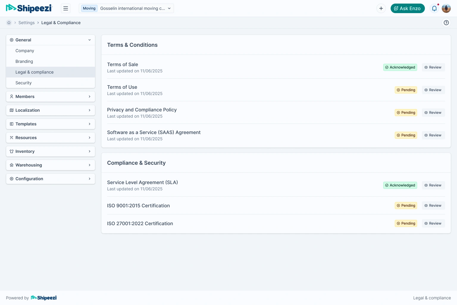
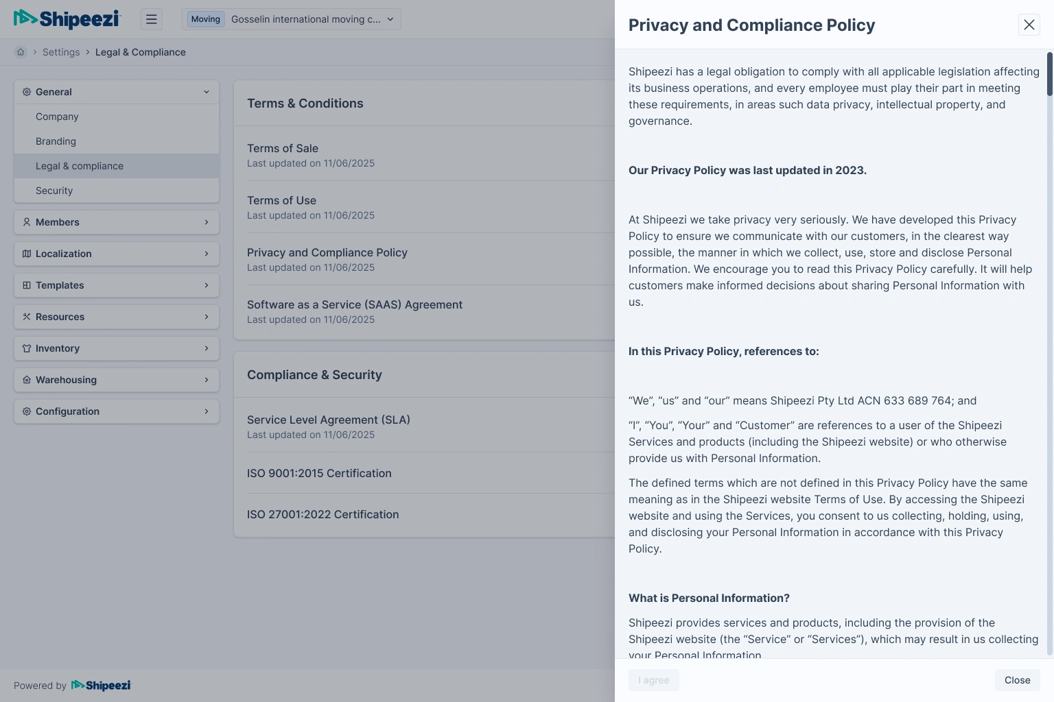
- Dialog & Drawer Patterns: Created standard modals and side drawers with tokenized spacing, consistent escape/confirm actions, and accessible keyboard flows
- Feedback & Status: Added toast notifications, empty states, and status indicators with color token mapping to avoid WCAG issues
All interactions were documented in Figma using variant-level interactions, so developers could preview expected behaviors without needing prototypes.
These improvements not only reduced developer guesswork but also made interactions feel familiar and fluid across all products.
🤝 Dev Collaboration
Throughout the project, I worked closely with developers to ensure:
- Tailwind classes in designs matched their implementation
- ShadCN component were considered while designing props and variants
- Legacy Bootstrap/MUI dependencies were being replaced in parallel
Every Figma component came with token mapping and Tailwind annotations, which made implementation easier and faster.
🧠 Reflections & Learnings
Final Outcome
- A fully documented design system, built from scratch
- 200+ clean, scalable components aligned with the development stack
- A ready-to-roll dark mode system, based on tokens
- Visual consistency across all screens and brands
- Significantly faster front-end development with reduced design – dev friction
Impact
- Frontend delivery speed increased by ~40%
- Developers now rely on a single source of truth for UI components
- The system is future-ready for additional brands
- Codebase was simplified by removing MUI/Bootstrap bloat
- Product teams now enjoy consistent UX and stronger brand identity
What worked well
- Starting from scratch was hard but necessary
- Tailwind + tokens provided a great balance of flexibility and structure
- Developer-first design choices built long-term trust with engineering
Challenges
- Cleaning up years of design debt while still supporting live product changes
- Aligning components between design and Shadcn UI
- Educating the team on using the system correctly across brands